10 Lightroom Preset Brands For Streamlining Your Workflow

Lightroom presets are a funny thing. Some people love them and some people hate them.

The problem with Lightroom presets are the ease of creating overly dramatic effects that can ruin a photograph. The trick is to create presets that have the ability to create subtle effects and local adjustments so the end-user (photographer) has the most control over his/her photograph.

Lightroom Presets

Below is a list of some of the top Lightroom preset creators. Each have their niche or own functionality. We highly recommend checking them all out.

SLRLounge

SLRLounge has a powerful pack of Lightroom presets.  Nearly 208 Presets including 182 Develop Presets and 26 Brush Presets.

  • Basic Color Correction
  • Faux HDR Processing
  • Vintage Fades and Washes
  • Black and White and Antique Efects
  • Tilt Shift and Toy Camera Special Effects
  • Detail Enhancing and Retouching

slrlounge-lightroom-presets

PresetPond

The Presetpond Pro Line is a range of preset packages developed for next level photography.  For weddings, fashion, portraits or outdoors.

presetpod-lightroom-presets

Visual Supply Co.

For the VSCO Film pack, efficiency is everything. Native Adobe Lightroom controls and functionality enable you to get the look you want without ever leaving the Adobe Lightroom environment. This set includes VSCO Tools, a set of highly refined presets that give you the ability to quickly customize grain, fading, toning and more. The tools include presets addressing dynamic range issues like blown out highlights and underexposed areas.

vsco-film-lightroom-presets

Pretty Presets

Pretty Presets is a Lightroom Preset factory.  They push out awesome presets often, each with their own special place in a photographers heart.

prettypresets-lightroom-presets

Stuck In Customs

Trey Ratcliff’s Stuck In Customs has never released Lightroom Presets before August, 2012.  Pick up his complete bundle which includes:

  • A dozen HDR-in-Lightroom presets
  • 28 edgy and gradient presets
  • 36 extra moody presets

stuckincustomsx-lightroom-presets

MCP Actions

Breeze through your photo sessions faster and make your images look better with MCP Actions. Adjust color, add contrast, convert to black and white, or give your photos a cross processed or vintage twist.

msp-actions-lightroom-presets

onOne Software

onOne Software is known for developing software to keep photographer shooting.  However, they also make Lightroom presets.  Check out the marketplace to see the onOne Software tested and approved Lightroom presets.

ononesoftware-lightroom-presets

X-Equals

Photographers have been searching for a single point of contact they can trust for their digital workflow and imaging technology needs. At X-Equals they focus on delivering no-nonsense, cost-effective solutions for both up-and-coming and seasoned photographers.

x-equals-lightroom-presets

Xposure Pro

The Xposurepro Lightroom presets will give your photos that extra something.

xposure-pro-lightroom-presets

Totally Rad

Totally Rad offers 100+ Lightroom Presets, encompassing 51 unique tools, which will help take your images from bland to AWESOME in record time.

totaly-rad-lightroom-presets


Honorable Mention

Of course, please don’t forget to check out Scott’s photography presets.

Your Turn

What is your favorite Lightroom preset brand?  Are you using one from this list or do you prefer another? Please comment below to share.

Thanks for reading

Win a Complete Set of Instamatic Presets for Lightroom

This week we have a brilliant little give away for one lucky reader. Lightroom presets have given us a copy of their brilliant Instamatic preset packs to give away worth $25.

The Instamatic presets for Lightroom are presets that brings back the look, feel, unpredictable beauty, and fun of plastic toy cameras from the past. Every preset will change your lens, flash, or film.

[box]The winner of the Preset Pack is This photo by : Gwenn McGill[/box]

Everyone has seen the hip photos created with the latest iPhone applications but now you can get the processing but with all the quality of high resolution images.

In one click you can apply the preset and make adjustments as necessary.

Each adds a unique touch to your photo, so mix and match to find your favourite preset. The competition includes all 18 of the Instamatic presets for Adobe Photoshop Lightroom.

How to Enter

To enter all you have to do is add a photo to the Seven by Five flickr Group that you think would look even better with one of the presets applied. Once you have added the photo to the flickr group come back and here and post a link to the photo and tell us why you think it would look even better?

[box]Rules: Winners will be selected by two judges and announced on 17th September 2011. The judge’s decision is final the presets will be delivered by email within two working days. [/box]

The Growing list of Aperture Presets

Yesterday we posted our growing list of Adobe Photoshop Lightroom presets and today we thought we would offer the same for our Apple Aperture users. Personally speaking I use both Lightroom and Aperture for different things as both are excellent applications, actually I my perfect application would be a mix of both……

Developer presets is a reasonably new concept in Lightroom being introduced in version 3 so the list is still growing. If you are knew to Aperture then check out our guide on how to install presets in Aperture.

One final tip, if you use Aperture and post your photos to flickr then check out my good friend Fraser Speir’s brilliant Flickr Export plugin.

Free Aperture Presets

21 Free Aperture Presets
Aperture Land
Apple Aperture Presets
Aperture-Presets.com
Presets Pond
Aperture Assistant
Free Sin City Preset
Smith FineArt
Terry Chay
Aperture Presets on Tumblr
Seim Effects

Support and Community

The Apple Aperture Flickr Group
The Aperture User Network
Managing Presets in Apple Aperture
Using Brushes in Aperture 3

Any Others

I am sure we have missed some great sources of free Aperture Presets. If you know of any good sites then why not share them with the community via the comments.

Designing Emulation Presets for Lightroom (Download)

Hello, allow me to introduce myself briefly. I am Michael from LifeInDigitalFilm and X-Equals. I am a hybrid photographer; shooting both digital and film, and I combine both into the same Lightroom workflow. My experience with film leads me to excel at emulating the look of film in Lightroom, creating presets designed for a RAW, digital workflow.

When we at X-equals release Lightroom presets, be it for sale or free, we strive top provide the highest quality presets with the greatest level of functionality possible. To this extent, I have created a step by step process to emulate the look of any given camera and film combination, allowing for the simulation of the look in an accurate manner. We take our presets very seriously and put in a lot of effort and testing to ensure quality emulations. So today I am going to share a basic development process for creating an emulation preset.

Originally I was going to emulate a 35mm Holga, however, my Holga has seen better days and the shutter was sticking. Instead, I broke out my old Polaroid Sprit 600 along with a pack of expired Polaroid 600 instant film (expired 2/2006) I fished out of the freezer. People like the look of Polaroid, right? Well, it is close to a toy camera, with a single element plastic lens at about 100mm, fixed focus. So, let’s get this process started.

Phase I: Calibration

The first step of emulation, for Lightroom or any other purpose, is to have a completely color calibrated workflow. If your colors are not calibrated, from camera to scanner to monitor, there is absolutely no hope of an accurate emulation. The first step I take is to calibrate the monitor, utilizing my old Pantone Huey. A fresh calibration before any emulation is an absolute must; otherwise there is a chance of color drift skewing your results. Once the monitor is calibrated, move onto the scanner.

The next step is calibrating the scanner. As the scanner is the only way to get the film samples into Lightroom, it is imperative that it is accurately calibrated as well. If not, you are not getting an accurate rendition of the film, and therefore cannot accurately emulate from your sample shots.

I utilize SilverFast 6 AI-Studio IT-8 for my emulation scanning. This software package also includes IT-8 targets for calibrating photo scans, film scans and Kodachrome scans. These IT-8 targets automatically calibrate the color response generated from the scanner to ensue accurate reproduction. As the Polaroid film produces an actual print, I will calibrate my scanner for photo prints, using the print IT-8 target. For more information on calibrating your scanner, check out SilverFast’s guide to scanner calibration, which will get you started.

Calibration

The final step for preparing to emulate is to calibrate your digital camera in Lightroom using Camera Profiles. This is vitally important, as you want to start with the most accurate representation your camera can generate, and ACR Camera Profiles is the best tool to do so. This is a rather involved process, so check out my article on X-Equals covering the basics of Camera Profiles.

Once you have calibrated all aspects of your color management system, we are ready to go out in the field and get some sample shots.

Phase II: Sample Collection

The second phase of emulation is collection of sample images. This requires the use of a variety of subject targets and shooting a few scenes. As I am utilizing a Polaroid, I am limited to 10 sample shots, so every shot counts. The more sample images you have to work from, obviously the better your results will be.

I start by shooting an X-Rite Color Checker, with both the sample camera and my digital camera. Set the color checker into nice, balanced light, and utilize a tripod or camera rest if possible. I will shoot one shot of the color checker with my Polaroid, and then I will shoot a second shot with my digital camera, utilizing a 50mm lens. Ideally you want to use equivalent focal lengths on both the sample camera and the DSLR, but sometimes that is not possible and the 50mm is a good option in that situation.

Colour Checker

Before shooting, there are a few steps that should be performed on the DSLR before you shoot the sample images. Set the DSLR to its base ISO, 100 or 200 depending on model, to reduce noise and improve color accuracy. Shoot all DSLR shots in RAW, and set a custom color balance off a gray card, to ensure color temperature is as close as possible.

Each of the following targets is shot, with both the sample camera and DSLR. Also a few subject shots are taken for fine tuning. The target or subject name and reason for use is listed in the list below.

  • X-Rite Color Checker: Used to generate the color mix in the Lightroom HSL to emulate color response.
  • IT-8 Print Target: Used to ensure and tweak color mix generated with the color checker.
  • Graph Paper Target: Used to analyze and emulate the lens distortion of the sample camera.
  • Portrait Shot: An image of a human subject used to check for skin tone consistency.
  • Landscape Shot: To ensure that color reproduction is reasonably accurate.
  • Still Life Shot: Again to ensure color reproduction accuracy.

Additional shots may be taken, as the more comparisons available, the easier it is to fine tune the emulation. Remember to shoot the shots as identically as possible with the two different cameras. Attempt to frame the shots as closely as possible. Since I am shooting a Polaroid for my samples, I am going to attempt to compose for a squarish crop, other wise I would fill the frame is emulating 35mm.

With that we can move back to the computer.

Phase III: Scanning and Uploading

So, once all your sample shots are developed, which was rather fast for me as I was working with Polaroid media, we are ready to scan. Earlier I calibrated my scanner for photo scanning from prints, which would be accurate for Polaroids. If I was shooting Slide or Negative film, I would have calibrated with that destination in mind. But I am now assured that my scanner will reasonably approximate the appearance of the Polaroid original.

Now, things get a bit tricky. I want to scan in my samples at the highest quality possible, retaining as much color and image detail as possible. The first issue is color depth, which needs to be set at 48-bit (or 16-bit/channel in Photoshop parlance). This setting ensures as much color data as possible will be saved, usually much more than a scanner can produce. For a bit more information on bit depth, check out this article on X-Equals.

The next important setting is resolution. In SilverFast this is accomplished by using the DPI slider. Other scanning apps will let you set your specific resolution. I want to get as much detail as possible from my scan, so I am setting my print scanning DPI to 1200 (Normally you would use 600 for print scanning).

SilverFast Dialog w/ Settings

I apply no sharpening inside the scanning application, as I want my data as untouched as possible. If I find I need to sharpen for fine detail, I will do so later. Sharpening can produce undesired changes to the image, so I make sure to leave that out. If you are new to scanning, here is a primer to get you started.

After the scan is complete, I will double check my results compared to the original. It should be close, but it will have a variance to the eye due to direct lighting in the scanner as compared to ambient lighting. If something seems drastically amiss, I will attempt to rescan, possibly adjusting the preview scan before I perform the new scan. But the idea is accuracy, not aesthetics.

Color Checker Polaroid Scan

If I was scanning film, I would have approached this with slightly different settings. I would have scanned using the 48-bit HDR feature in SilverFast and scanned in at a 3200 DPI for 35mm or smaller film or 1600 DPI for medium format. The resultant scans would have been rendered using SilverFast HDR before saving the final TIFF files. Questions regarding DPI and PPI, check here.

The export of the scans is vitally important as well. Images should be saved as 48-bit TIFF files. This ensures every pixel generated is manipulated as little as possible. No down-sampling of color and no compression applied. This results in huge images, but will ensure accuracy.

Now, I will fire up Lightroom and import the resulting TIFF files into the Library. Then I upload the RAW files from my DSLR as well. I add all the images, scans and RAW, into a new Collection in Lightroom. With this, I am finally ready to start the emulation process.

Phase IV: Emulation

Now that all the images are uploaded we are ready to start the emulation process. This can be a bit tedious to do, but is very rewarding once everything starts coming together.

First, select the Color Checker sample from the scan. Before I go any further, I crank up the Color Noise Reduction slider in Lightroom, eliminating color variances in the scanned image. Then I will set the White Balance in Lightroom to the third patch from the right, on the bottom row of the Color Checker, just under Yellow. This gets reasonably close to an 18% Gray. After the White Balance is set, I turn the Color Noise Reduction back down to zero, restoring the natural colors to the image.

Adjusting WB

Then, I Copy the White Balance setting from the color Checker Scan to the IT-8 scan as well. The reasoning for doing this is to remove any color cast from the scan, allowing me to emulate the “true” colors.

WB Comparison

Now, I start comparing back and forth, between my scan and my RAW file (which should have a custom White Balance applied, eliminating the need for setting its White Balance.) I start with the Primary colors and adjust the RAW file’s Hue, Saturation and Luminance for each color in the HSL panel in the Develop Module. As I get the Primary colors accurate, I move onto the Secondary colors, adjusting them the same way.

Working the HSL

As I slowly get all the colors to sync up, I move on to the Tertiary colors, until I get all the color patches of the checker reasonably close. The colors may be too dark or light, but I fix this by adjusting the Tone Curve until I get close, then I re-address the HSL. I will often jump between HSL and Tone Curve adjustments many times in this process.

Once I am satisfied with my color mix (and often you have to make do with close), I am ready to check the overall color response.

If you are not familiar with the HSL tools in Lightroom, check out this tutorial.

To check my rendition of color response, I create a new preset from my color checker image, adjusting the Treatment (Color) and Tone Curve. I then apply this preset to the IT-8 RAW sample and compare it to the scanned IT-8. It should be close, if it is not I will make some minor HSL and Tone Curve adjustments trying to bring the full spectrum representation of the IT-8 chart as close as possible on the original scan and RAW adjustments.

Tone Curve

Once I have the color close, I update the preset with my new adjustments. At this point I consider my Color Mix complete. Now I revert both the Color Checker and IT-8 scans to their Import status, undoing the White Balance adjustment.

From here I look at the White and Gray patches of the Color Checker and start working the Split Tone sliders, attempting to reproduce the color cast preset on the Polaroid scan. Once I am satisfied, I update the preset, adding the Split Tone adjustments. I then check the effect again on the IT-8 chart, if I am satisfied, I move on.

Split Toning

The next step is to address the overall tone of the scan. So, I will apply the preset to Portrait, Landscape and Still Life shots. I check the tone and clarity of the original, and set the Clarity on the RAW file and lightly adjust the Tone Curve until the tonal qualities of the original and RAW file start to get similar. I update the preset again adding in the Clarity and updating the Tone Curve.

While I have the Portrait sample open, I check the skin tone and make sure it is well balanced between the scan and RAW file. If the preset is making the skin too Orange, I will back off the Orange Saturation until the skin looks better, the less adjustment the better. If the preset is not popping enough in the skins, I up the Orange Saturation just until the image looks right. Once the skin looks right, I update the Treatment (Color) in the preset.

My next step, and my last when doing film emulations, is the grain analysis. To do this, I jump back to the Color Checker scan. I zoom in first on the White patch, usually at a 1:1 zoom. I look at the grain density, size and shape and then hop over to the RAW color checker image and zoom in. I try to zoom the RAW file in to about the same size as the scan.

This may require using a 2:1 or even 3:1 zoom depending on camera model. Once I get it close, I attempt duplicate the appearance of grain as closely as possible.

Grain Detail

This is hard, as the Lightroom Grain does not look 100% like the grain in any film, but it can get a reasonable approximation. After I get the White patch close, I check it against the Black, then Red, Green and Blue patches. Once I am convinced I have it as close as Lightroom allows, I update the preset adding in the Grain settings. Due to the nature of Polaroid film, it does not have traditional grain or dye clouds, but still a discernable grain pattern. Lightroom does not emulate this well.

At this point the “film” emulation is complete. Now I will try to simulate the effect of the plastic lens of the camera. This process uses the graph paper target, so I open the scan of that target. I zoom in around the edges, looking for any distortion in the lines of the graph.

The focal length of the Polaroid seems to create a slight pincushion effect at the edges. Not normally evident, but there none the less. I then hop over to the RAW file and attempt to adjust the Lens Correction, primarily the Transform, sliders to approximate the distortion.

Then I hop back to the scan, zoom in and attempt to refine the adjustment to the RAW file. Once satisfied, I update the preset including my Lens Correction, Transform adjustments. If a vignette was present I would add it here as well.

Lens Correction Settings

The softness of the lens should be evident in the preset already, but if the image does look softer in the fine lines of the graph, I drop the clarity until it looks correct. Negative Clarity starts to induce softness to the image and can be useful in cases like this. However, there was no need to refine Clarity for this lens.

The final step of this emulation is to add a light leak. Although I had no sample shots that included a light leak, but it can be common in Polaroid film, so I want to add in the feature. Sometimes it is the camera to blame, other times the film gets the edge exposed to light in packaging, other times it’s the result of an edge cut being included in a film pack. Either which way, it has been frequently seen in Polaroid images, and worth of inclusion.

To do this, I am going to add a Graduated Filter to the left side of the frame. This preset will simulate a bruch frame, which is the term for a quality control reject frame. After I add the graduated filter, I am going to crank up the Local Exposure to blow out the image, and then throw in a Red Color adjustment to add a slight color cast to the light leak. Also, I drop the Local Clarity to really soften any subject matter in the over-exposed area. Once again, I update the preset, adding in the Graduated Filter.

Grad Filter

Remember, the filter will be added to the position of the RAW frame the same way every time. The end user can relocate or shift this filter as desired. However it will always default to the same side of the frame, adjusting to the top or bottom when shot in portrait orientation. Multiple light leaks can be created in a preset, but I chose to do one as it is a common abnormality.

Final Example

With that, my emulation is complete. No I test the new preset on other images in my catalog, ensuring I get consistent results. The preset will not play well with severely over or under exposed images, but when the expose is close; it should look nice, depending on lighting. Any given emulation is not representative of any film stock or camera as a whole, but is specific to the pack or roll shot for testing and the camera used. Anyways, now that my emulation is complete it is time for packaging the download.

Before and After

Part V: Packing for Distribution

The final phase of creating a preset, be it an emulation or otherwise, is packaging for end-user download. At X-Equals, Brandon and myself both take quality and utility very seriously, and to this extent we develop our presets to be used as a platform, not simply one-click fixes. As such we have developed our Preset Platform, designing presets to be modular and compatible with one another, making presets tools to expedite processing as opposed to simply an end result.

We have furthered this belief with our new XeL Platform, which takes things even further, breaking presets down to small presets that apply only a specific effect that can be mixed and matched to allow the end user to rapidly create their own unique looks from our available effect. XeL presets overlap very little in effect adjustments, ensuring that many effects can be rapidly layered. This allows the end user to look away from the Develop Module adjustments, focusing on component effect presets to rapidly edit their image, leaving the fine tuning for last.

So, I’m going to break down this new XeL Polaroid 600 preset I just developed into its proper component presets. First I will start by renaming the preset to XeL Polaroid 600. I will then create a new Preset folder in my Preset panel, named XeL Polaroid 600. This first preset contains all the effects I just developed, and is the typical 1-Click and go type of preset.

From here I will apply the new preset to a new RAW image. I will now create a preset entitled XeL Polaroid 600 Mix, which contains the settings for the Color Mix only, selecting only Treatment (Color), Color and Color Adjustments checkboxes in the New Develop Preset dialog. Next I will create XeL Polaroid 600 Tone, adjusting only the Tone Curve and Clarity checkboxes, rendering our image tone into a preset.

Now, I make the XeL Polaroid 600 Grain preset by selecting only the Effects and Grain checkboxes, making the Grain setting their own preset. Then I save the XeL Polaroid 600 Toning preset, by making a new preset and selectin only the Split Toning option, saving our custom color cast.

Next is the Lens effect, contained in XeL Polaroid 600 Lens, which needs Lens Corrections, Transform and Lens Vignetting selected. Finally I create the XeL Polaroid 600 Leak preset which packages up the Graduated Filter and its location, by creating a new preset with the Graduated Filters selection checked.

With that the entire original preset has been broken down into 6 new component presets, with which you can add any individual effect to any image as desired. This comes in handy when you only want the Color Mix added to an image without all the other adjustments. This opens up all the work put into the preset, making it completely functional with each effect being applicable on its own.

So now, you can go ahead and grab the new XeL Polaroid 600 emulation, containing the total emulation and its 6 components and use it in your own workflow.


Download the Adobe Lightroom Presets. 


Hopefully, sharing this has shown the level of effort that we have put into our preset collections at X-Equals. Check out our store and see what we have to offer.

These emulation presets are a time consuming endeavor, most taking more than 5 hours to perfect and as you can see a rather lengthy process to render a final product. My preset development cycle is definitely not for everyone, but I enjoy the results it produces. I hope you do as well.

[box type="shadow"]Article by Michael W. Gray

X-Equals

LifeInDigitalFilm[/box]

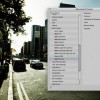
Managing Presets in Aperture 3

If you find you are making the same type of adjustments to photographs on a regular basis then saving the action as a preset is a useful way to speed up your post production workflow.

Alternatively if you are only starting out using Aperture for your photo management processing then pre-made adjustment presets are a great way to learn how to develop your RAW photographs to achieve the look you require.

There are a number of websites out there that offer free Aperture (and Lightroom) presets, one example is www.presetpond.com that offers community sharing Photoshop, RAW processing, Lightroom and Aperture workflows for free.

Once you build up a collection of presets it is definitely worth spending some time organising them and culling the ones that you no longer use. To manage presets click on the “Adjustments” tab and then “Presets”. At the bottom of the list you will find two options, one to save a preset (use this to create your own) and one to edit presets.

Click edit presets to manage the adjustments you already have in your library.

I tend to keep my presets organised in folders according to style e.g. Black and White, Vintage etc. Click on the little gear on the bottom left of the window to create adjustment groups or to delete a preset.

There is nothing harder to manage than a long list and personally I have found a long list of presets actually slows accessing each adjustment a little slower as Aperture tries to render a preview of each preset as you scroll down the list.

Once you have arranged your presets in an efficient way you can get to grips with processing your images. Personally I use a preset as a point of reference and generally work each image separately. It is definitely worth treating each photo on its own merits as there are definitely times of ten presets can actually spoil a good photo.

Introducing Presets in Lightroom 2

This summer I embarked on a photographic adventure exploring the power of Adobe Photoshop Lightroom 2. Previously my photography workflow involved a brief encounter with Apple Aperture and then back to the comfort and simplicity of iPhoto with Photoshop as an external editor.

Adobe Lightroom has transformed my opinion on photography post production completely and not to exaggerate too much has revolutionised how I not only process my photos and also the resultant photograph.


One of the great aspects of the software is that it is usably right out of the box in that you can manage, manipulate and publish your photos quickly and easily. That said the more I use the software the more power and opportunity it offers.

If like me you are somewhere between complete novice and pro and don’t quite have the confidence to use Lightroom’s image control tools unaided then ‘Presets’ are an excellent way to explore different (non destructive) photo outputs. It took me a month to realise there are considerably more presets out there than those shipped with the product and in actual fact there were a stack of photographers out there developing and supplying (many of them free) their own custom presets.

Presets are simply a one click image transformation for your photos. Personally I think if you are going to get the most from Lightroom you should think of presets as a starting point, i.e. add the effect and then apply your own future adjustment to attain the desired output, don’t just apply a preset and export.

I have been using a range of presets over the last month and in addition to the obvious benefit of transforming my images I have also learned a considerable amount in how the ‘Develop’ tab works in Lightroom and how to manually manipulate my photos. Admittedly not all presets out there are free but any I have paid for have cost around $10 for a set which is perfectly affordable (just).

Installing Presets is simple. Load Lightroom, select any image and click on the Develop tab on the top right of the application. Now right click in the presets tab (left of the screen and select “install” Find the preset you have downloaded and want to install and Lightroom will add it to the Presets menu. As your list of presets grow you can create folders for easy management and access.

Lightroom ships with a nice set of presets but here are some sites that offer both free and premium presets. If you know (or find any others) I would love to hear about them.

Presets:
640 Pixels Presets
Vintage New York Preset
Max Payne Style Preset
The Lights Right Presets
Camera Dojo Free Presets
Rebecca Myers Presets
Shutter Sisters Presets
Mark Elkin’s Presets
Better Black and White
Preset Heaven
Gantico Presets
Rebecca Lily’s Presets

Book : Iceland, A Monograph

As you know I am a massive fan of the Print & The Process eBook series by David duChemin. The latest release, Iceland, a Monograph is the perfect format to show David’s photographic vision and creative process behind his recent trip to one of the world’s most stunning places.

Moved by the incredible landscapes, the vastness of the open spaces, and the extreme weather, David created photographs that first and foremost inspired him.

ICELAND, A Monograph, is a showcase of exceptional photographs and it holds nothing back with respect to how the images were created. This eBook is the first look at 39 of the images David created in Iceland.

The curtain is pulled back on technique – like how he used three different ND filters to work through an exposure problem, as well as the more internal processes related to creation – like finding inspiration and working through the frustrations of finding one’s vision.

The process and thinking behind those photographs are explained from a technical angle and the discussion of post-processing includes two free downloadable Adobe Lightroom Presets. For you travelers, David also briefly discusses logistics involved in the travel and supporting the digital workflow while tenting his way through Iceland.

ICELAND, A Monograph – The Print & The Process is larger than usual – a full 65 spreads of photographs and insights that will inspire as you develop your own craft. This is easily one of the books about which we are the proudest! The downloadable PDF is just $5USD.

Special Offer on PDFs

For the first four days only, if you use the promotional code ICE4 when you checkout, you can have the PDF version of ICELAND, A Monograph – The Print & The Process for only $4 OR use the code ICE20 to get 20% off when you buy 5 or more PDF ebooks from the Craft & Vision collection. These codes expire at 11:59pm PST September 12, 2010. Download it now.